The need for a style guide
I am trying to level up my designs, but I always feel behind because I don’t have a fully realized template file for everything. So this summer seems more low key for me so I’m going to try and work on building more workable template files for my paperwork, cue sheets, VW light plots, Lightwright, and I’m thinking about finally paying for filemaker to build my own version of Mike Wood’s Paperwork Management Portal.
I started about a month ago during a dance competition at work I was babysitting and building a lightplot for a venue I haven’t worked before and I wanted to print on 11x17 but my title block didn’t fit so I worked on rebuilding my title block to fit that page. Now my title block I stole from other designs that have come across my desk and I have tried to rebuild into something I can work with.
When I was in college I don’t think enough discussion was put into graphic design and I wasn’t told to take a class in it and now I wish I had. Title blocks were just an ends to a mean and had no style to it.
This is no surprise because we also didn’t have a specific drafting class. In scenic design 1 we were taught to hand draft, and had a few good projects but not enough practice. We also had to work on renderings and designing the sets that were also assigned in that class. In Lighting class we moved on to Vectorworks, but I don’t think the professor knew enough about how we should be using Vectorworks to teach more. we were drafting in scale, but there wasn’t any discussion about how we should be using classes and there was no style guide for us to use lineweights in vectorworks.
Now as a proffesional for 20 years I feel like I’m going back to do things I should have done back in coleege. I loved all of the webinars people did during the pandemic, but still haven’t implemented all the things I learned, and because I don’t leave myself enough time between projects I fell into bad habits of my ad-hoc get it done style. I also took some great classes from Studio School of Design and have loved the classes I’ve taken and want to take more.
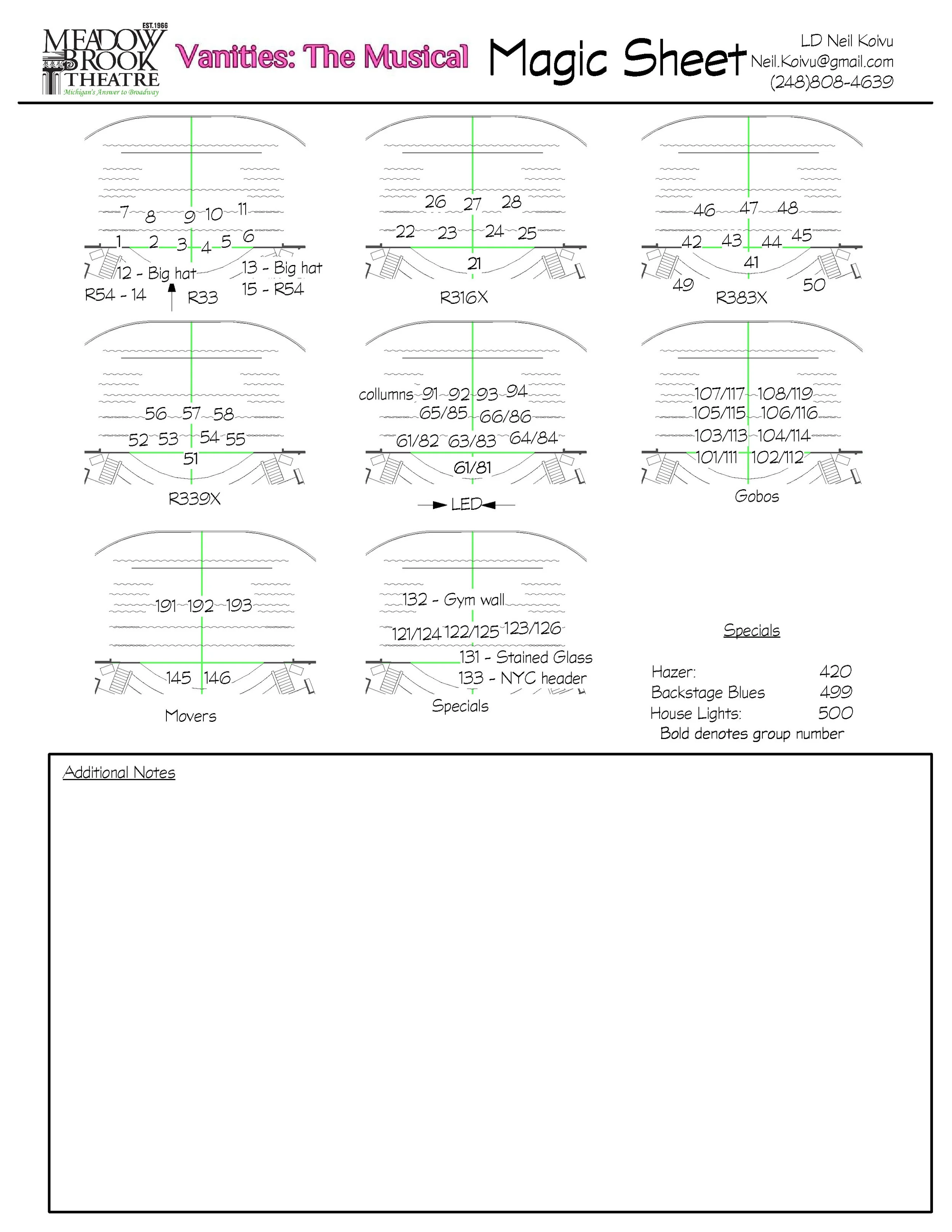
So now is the time for me to take the summer and update my template files. I’ve updated my titleblock to fit 17x11, 11x17, 36x24, and 48x36. Now that I have access to an 11x17 printer again however I thought, now that my title block fits 17x11 I should rebuild my magic sheet to fit 11x17 and make it more graphically pleasing.
“Good artists borrow, great artists steal” so in search of a style guide I’m using examples from Mike Wood Lighting Design to upgrade my magic sheets. I’m still making it my own. I’m using my title block on the right hand side, it has more information I need on a magic sheet, but I do love making all of my paperwork feel like they are a set and go together. I also know Mike Wood loves to do his Magic Sheets in Adobe InDesign, and while I have access to InDesign I’d rather have it in Vectorworks so it is all in one file, so that when I go to remount a show (which I have done a few times) I have one file that has all the information I need to remount a show. The more I can get things streamlined the happier I will be. Also my current magic sheet I squished too much, it looks a mess, and I want to have more information at my fingertips. But I still want to be able to have a 1 sheet version, so I’m planning on fitting a conventional magic sheet on the left had side that I can still print on 8.5x11, but the full thing will have info for me to help me program the show. Looking back at what I dd in college it’s surprising that that is what I used to do and got away from but am coming back to a little bit, but in different ways.
Anyways this is a work in progress, and I don’t expect anyone to read my thoughts but it’s helping me put my thoughts down to organize myself.
Exampe of title block from college on the left to my upgraded title block from the last 4 years on the right.


Example of title block from college on the left to my upgraded title block from the last 4 years on the right.

Examples of my Magic sheet from college, the actual magic sheet from the last show I designed at Meadow Brook, and the new template I’m working on to have for the next shows I will be designing next season.
